

In a recent blog post, Lexi explained how to best use line, surface, and volume plots. We will now look into arrow plots and how you can use these to your advantage. After a beginner’s guide, you’ll get a “look in the kitchen” via a very interesting industrial application where arrow plots played a crucial design role in winning a consulting assignment.
What Are Arrow Plots and When Are They Useful?
The arrow plot is a very powerful tool for visualizing field distributions. In COMSOL Multiphysics, we typically compute fields — whether this pertains to turbulent flow velocities, magnetic fields, chemical species transport, or thermal gradients. All of these benefit greatly from being visualized properly.
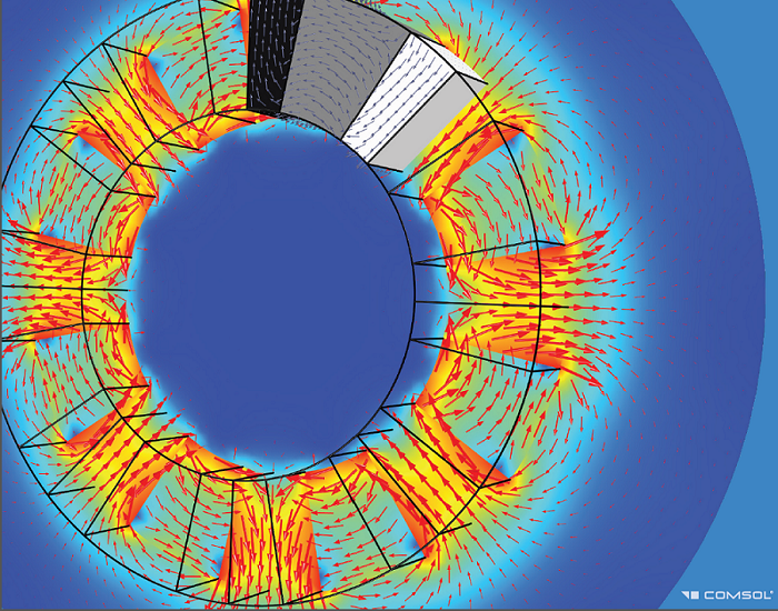
Generator: Using arrow plots for magnetic fields.
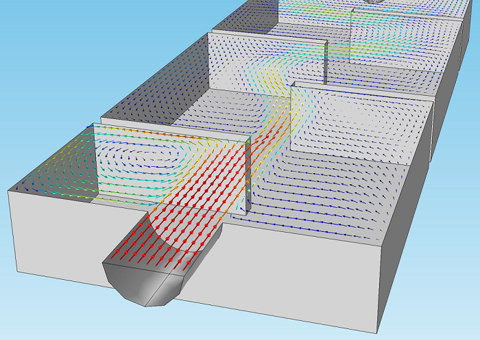
Ozone reactor: Using arrow plots for fluid flow vectors.
So How Does This Work?
Let’s go over the options step-by-step, continuing to use the Heat Sink model that Lexi used in our previous postprocessing blog post as an example.
Starting out, our model only has one 3D Plot Group with a surface plot of the temperature. By clicking on “3D Plot Group 1” in the ribbon or right-clicking “3D Plot Group 1” in the model tree, we can add an Arrow Volume plot.
![]()
You will notice that arrow plots exist in three dimensions:
- Arrow Volume, which plots the arrows in three dimensions: inside a volume.
- Arrow Surface, which plots the arrows in two dimensions: on a surface.
- Arrow Line, which plots the arrows in one dimension: along a line.
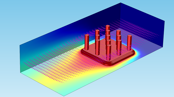
We’ll go for the arrow volume plot in this example, which gives us the following result:
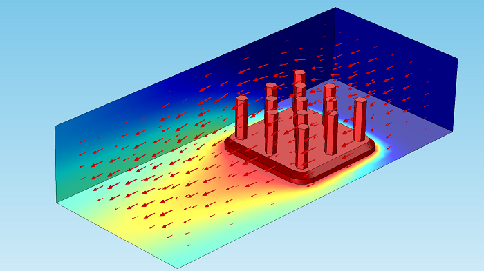
Although useful, it’s hard to gain significant insight with the default settings here. The problem here is two-fold: the arrow color doesn’t stand out enough and the volume is stacked with too many layers of arrows.
Let’s start by tackling the first issue. It seems more convenient to choose a more contrasting color — we’ll go with magenta for now. The arrow color can be modified in the settings window, as displayed here:
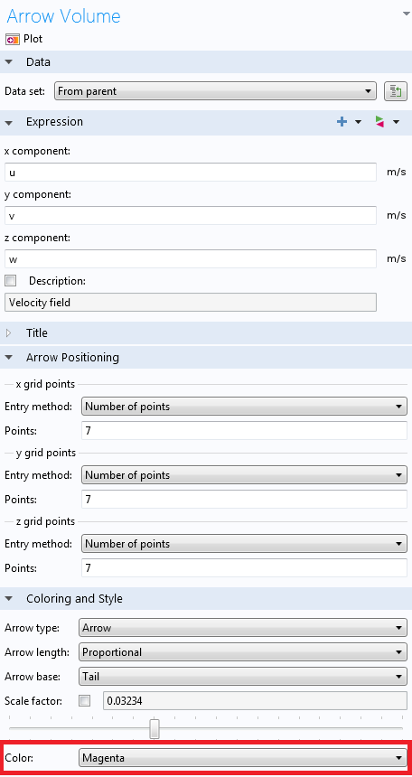
Furthermore, we’re better off plotting only one layer of arrows. This can be changed in the same settings window, where the grid points can be chosen:
![]()
That gives the following result:

Hmm… Still not so great. What we need are more arrows in the in-plane directions, which are the x– and y-directions here. We’ll change them to 35 to get:
A more insightful perspective can be obtained by clicking the “XY View” button, located above the Graphics Window.
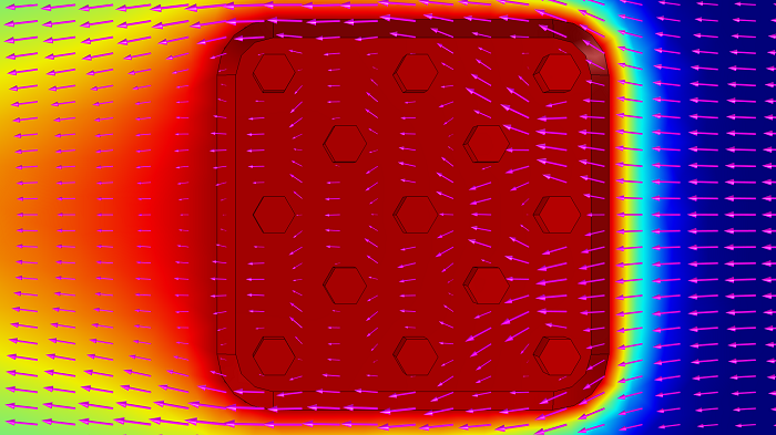
We can easily see how the air finds its way around the heat sink rods, as well as the reduced velocity behind them. This is where the arrow plot provides unique insight into what is going on; if we were instead using experiments, obtaining this information would be very difficult, if possible at all.
My roots are in experimental physics, and over the years, I’ve seen and felt the obstacles within performing such measurements. Think: Expensive downtime, challenging device scale (from microfluidics to enormous water filtration plants), equipment cost, having to interpolate — sometimes guess — between a limited amount of data points, probes influencing the measurement itself, and so on.
As you will notice in the plot, the arrow length is proportional to the velocity by default. This can also be set to Normalized and Logarithmic. The two latter options are great, for instance, to visualize local vortices, which generally have low velocity amplitudes compared to mid-stream values.
![]()
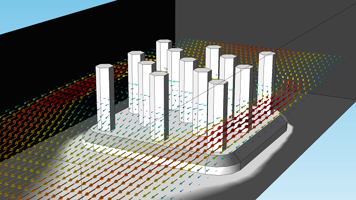
Until now, we’ve chosen just one color for the arrows, but they can also be given a color proportional to any expression. This can be done by right-clicking “Arrow Volume 1” and choosing “Color expression”. By default, this will be given the Rainbow color table.
Changing the color table of the surface plot, we end up with the following image:
Now that you have an idea of how to use arrow plots, let’s have a look at why this is good to know.
Industrial Example: Failing Water Pump
I am from The Netherlands, and as you might know, about one third of The Netherlands is below sea level. For this reason, we’ve been very active in the field of water management, starting as early as the 10th century. It’s still a big engineering field today, and the following case falls under the umbrella of this application area.
Pumping Stations
Pumping stations are used to move water to a higher elevation level, such as to bring water to canals, drain flooded land, and for other water infrastructure applications. These pumps are very large in size — 50 m3/min and up. Below is an example of a water pump station:
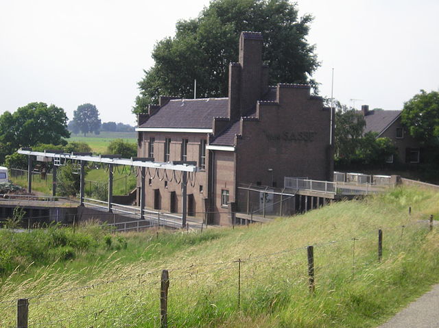
Pumping station. “Gemaal van sasse” by Vincent de Groot — http://www.videgro.net — Own work. Licensed under CC BY 2.5 via Wikimedia Commons.
In our specific industry example (not pictured above), a new type of pump was designed to handle a dynamic range of water levels on the inlet side. For various reasons, the designers decided to build an elbow-shaped pipe on the inlet side (imagine the shape of a classic faucet, but with the flow direction reversed). The specs of the pump — power and discharge — were more than sufficient for the job, but when connected to the system, the pump efficiency was measured as being much too low. The target specification could not be met, and, with deadlines fast approaching, the engineers were under pressure to quickly come up with a diagnosis and solution.
Confidentiality of the case prevents me from going into details, but it turns out that their chosen pipe geometry, at certain water levels, creates a swirling flow going into the pump entrance, which severely limits its efficiency. Testing numerous design variations in the field isn’t easy or cheap. Moreover, while you can measure pump efficiency, you would still be in the dark as to the details of the specific flow behavior. This would mean one has to measure a very expensive “black box”, with little idea whether the next design iteration will improve things or why.
For these reasons, the company hired an engineering firm that uses COMSOL Multiphysics with the CFD Module to resolve the issue.
What Was Going On?
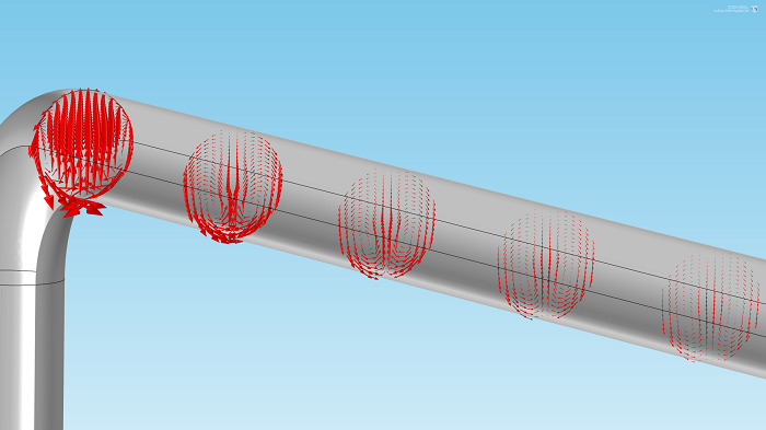
While I cannot provide specific details, I can show conceptually what was going on and why arrow plots were useful in convincing management to go for a specific design modification. For demonstration purposes, I’m using the Flow in a Pipe Elbow model, which is available in the Application Library.


Pressure drop (left) and velocity field (right) in a pipe elbow.
As the water flow is highly turbulent, going through a 90-degree bend will strongly distort the field. This can be seen in the velocity plot above, but we can perhaps make it more clear with an arrow plot. With our previous settings, the plot looks as follows:
")
")
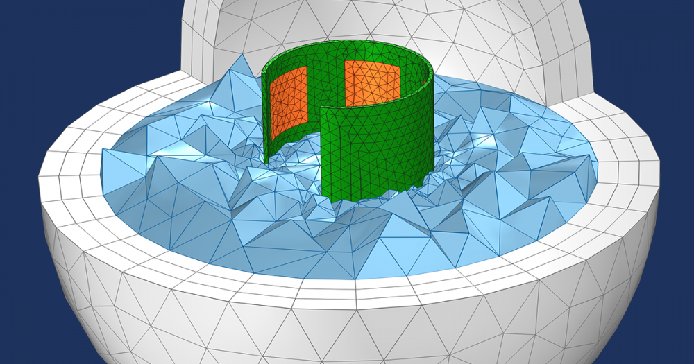
Because the water speed is still predominantly in the pipe direction, the in-plane speed is somewhat disguised. Let’s do something about that.
As always, you can modify any expression in COMSOL Multiphysics. In this case, we could multiply the in-plane directions of the flow field by a large factor, but it’s even easier to simply set the y-component of the arrow plot to zero:
![]()
And the result:
We can now very clearly see how the swirling flow components fade away over distance. Notice that these are not your typical plumbing-sized pipes, but sewage pipe size — the distance of flow settlement is significant and the water moves at violent speeds.
We can also export the results as an animation:
Here’s a closer look:
Winning the Assignment with Arrow Plots
In the situation of the pump designers mentioned above, the geometry of the entrance in combination with certain water levels created much worse flow distortion effects than those from the elbow bend. Now, to be clear, there are other postprocessing methods to put hard numbers on how quickly (or slowly) the anisotropy dissipates. However, in this specific case, the above images were of decisive importance to convince the higher-ups what the problem was and how it could be solved. The consulting firm in question managed to win the assignment over competitors by providing a quick and cost-effective solution guided by simulations.
Next Up: Slice Plots
If you have any interesting tips or applications related to the topic presented here, make sure to share them via the comments section below. Stay tuned for our next postprocessing topic: slice plots.

Comments (4)
Moadh Mallek
June 2, 2016Hello Mr Borger,
I want to simulate the movement of a plunger inside of a coil, this displacement is generated by the magnetic force from the coil. How can I couple the magnetic field physic and the moving mesh physic to simulate this displacement?
Thank you so much.
Ruud Borger, COMSOL employee
June 3, 2016Dear Mallek,
Great to hear about your modeling project. This example model may cover your question well:
https://www.comsol.com/model/electromagnetic-plunger-36671
For specifics, I recommend contacting support@comsol.com.
I hope this helps.
Best regards,
Ruud
Harish Puppala
January 26, 2018Dear Borger,
I want to simulate a 2D geothermal reservoir and study its response over exploitation. Could you suggest me how to couple 1D (pipes) and 2D elements (porous medium).
Ruud Borger
January 26, 2018Dear Harish,
That is an interesting question which goes beyond the scope of this blog. As such, it takes more time to explain; I’d recommend contacting your local COMSOL representative, or Support via support@comsol.com.
I hope that clears things up.
Best regards,
Ruud